Miner 2149 Postmortem: UI/UX is hard!
Contents
Introduction
Miner 2149 is an incremental clicker game designed to test the feasibility of using such a mechanic as a minigame within a larger solar system exploration game. The goal of Miner 2149 is to harvest a goal resource from a series of different types of asteroids and comets while harvesting other resources necessary for the operation and upgrading of the player’s excavator. In the larger game context, players will choose their target object based on the resource type required by the mission. In this prototype, the player is presented a fix sequence of objects in a trio of missions with increasing challenges.
Unlike many incremental games that permit the player to autogenerate resources indefinitely, Miner 2149 implements a mechanic that requires the player to be an active participant in the game continuously. In order to provide breathable atmosphere, potable water, and supply fuel to power the ship’s systems, the store of water and methane deplete over time. These resources can only be replenished using the ship’s Main Pulse Laser (MPL) which is only activated by the player’s click action on the largest button in the user interface. The MPL is also the only laser that can help the player harvest one of the goal resources, cyanogen.
The Rock Liberating Laser (RLL) is a continuous laser that harvests the three mineral types. Mineral resources can be used to upgrade a laser’s output power. The RLL can also help the player harvest one of the goal resources, diamond.
The Metal Liberating Laser (MLL) is a continuous laser that harvests the three metal types. Metal resources can be used to upgrade a laser’s cooling system, allowing the laser to dissipate heat more efficiently thus improving its duty cycle. The MLL can also help the player harvest one of the goal resources, iridium.
What Went Right
Temperature as a Pace Limiter
|
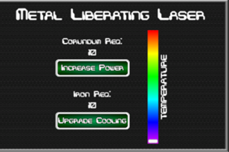
Figure 1: Status panel for the Metal Liberating Laser (MLL) showing the temperature colorbar gauge. |
Going into this prototype, I wanted to have a mechanic in place that would prevent a mindless grab for more power. Thinking about real systems, especially on a spacecraft, I tried using thermal loading as a limiting mechanic. As one fires the MPL or operates the RLL or MLL, that laser generates heat at a give rate. If the power output of the laser exceeds that laser’s ability to dissipate that energy, the temperature of the laser increases. This is shown to the player as a non-numeric, colorbar gauge. When the temperature gauge is in the red, the laser shuts down until it has cooled enough to resume operations. This requires the player to manage their laser systems rather than mindlessly button-mash.
Balance of Resource Roles
Each mission has a specific target resource. In Mission 1, the goal is to harvest diamond from a chondritic asteroid. In Mission 2, the goal is to harvest iridium from a metallic asteroid. In the final mission, Mission 3, the goal is to harvest cyanogen from a comet nucleus. During each of these missions, the player cannot simply focus on a singular material type. Although there is a specific goal, all resource types are required to improve each laser’s power and cooling rate, and to harvest volatile resources to keep the excavator functional. The player is required to manage all resources but with different emphasis for the different missions.
Depleting Resources as a Motivator
|
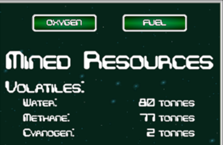
Figure 2: Status panel for the volatile resources and warning lamps for low oxygen and low fuel. |
In many clicker-style games, once automatic resource generation has been started, the player can walk away from the game and let it harvest indefinitely. For Miner 2149, and for its intended inclusion in a larger astronomy serious game, I wanted the player to be continuously engaged with the game. While mineral and metal resources can be harvested in a continuous and autonomous way via the RLL and MLL, volatile resources must be harvested with MPL which requires a player action. The Tier 1 and 2 volatile resources, water and methane, respectively, are depleted by the excavator at an increasing rate for each mission. This places a time pressure on the player to continue not only harvesting the mineral or metal goal resources, but also to operate the MPL to harvest volatiles. When the excavator runs out of both fuel and oxygen, the game is over. By Mission 3, the depletion rate is such that the player will have to stay very focused to harvest the goal resource quantity before the excavator is out of water and methane.
What Went Wrong
Upgrade Quantity Selection Unnecessary
|
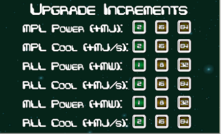
Figure 3: Laser power and cooling upgrade increments go largely unused. |
Integral to many clicker/incremental style games is the option of choosing how much of an upgrade one wishes to purchase in one click. This functionality has also been built into this prototype but given the time-limited aspect of each mission, driven by the depleting water and methane resources and reaching the target quantity of the goal resource, there is no game-driven use for these functions and the options go unused. These buttons take up a significant amount of UI real estate and do not provide any meaningful improvements to the gameplay experience for the player. One consideration is to reduce the increment intervals so that the highest increment value is attainable within the time limit of a particular mission. However, the values of these increments are low enough that a few quick clicks by the player on an upgrade button achieves the same effect. The conclusion is that the option to change the upgrade increments is not essential to the game and was removed for v2.0 of the prototype.
Tier 3 Resources Unnecessary
Another unnecessary element are the Tier 3 resources that are not goal resources. During Mission 1, the player is asked to harvest diamond, a Tier 3 mineral. There is no practical use for the Tier 3 volatile, cyanogen, nor the Tier 3 metal, iridium. These merely clutter the UI and provide useless data and distraction. For v2.1 of the prototype, these non-goal Tier-3 resources should not be displayed.
UI is cluttered
Good UI is simple UI. The UI for Miner 2149 is not simple. The challenge of disseminating large quantities of data to a user is one that faces many industries, not just game development. Key information must be identified and presented as clearly as possible followed by making supporting data easily accessible. The initial thinking for the UI layout of Miner 2149 was to place similar data types in the same area of the display. Therefore, all the power output and cooling rate data are presented together in the upper left. During gameplay, however, these data do not need to be presented together, but rather displayed next to where the player’s focus resides, with the activation and upgrade buttons for the lasers. The current v2.0 attempts to declutter the screen, but more work in this regard remains to be done.
Key UI Element Placement
There are certain key parameters that are critical to the gameplay of Miner 2149. Unfortunately, these are placed in disparate and less-than-optimal areas around the screen. Three of these parameters stand out more than others: the oxygen warning lamp, the fuel warning lamp, and the goal resource progress bar. These elements are mission-critical but are in out-of-the-way areas of the UI. As shown in Figure 4, the oxygen and fuel warning lamps are in the upper right corner of the screen. During the playing of the game, however, the player’s eye seldom if ever venture to this area of the screen. The goal resource progress bar is similarly out of the way, placed on the far right of the screen.
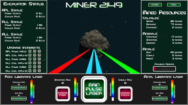
Figure 4: Main gameplay scene showing the overall layout of the UI elements in v1.0.
In v2.0, these issues have been at least partially addressed. All power and cooling rate data have been placed adjacent to their respective upgrade buttons. The progress bar for the current goal resource has been made larger, and the Upgrade Excavator button that appears when the goal amount has been reached has been relocated to appear in the main viewport just above the MPL button. This makes both items much easier to see and more prominent. To aid with what the goal of the current mission is, a status message is placed in the center of the screen stating what the goal resource is that disappears when the player engages the MPL. Lastly, the oxygen and fuel warning lamps are repositioned to the left panel under Excavator Status. These are also accompanied by new large gauges displaying the current supplies as percentage bars. This makes these key elements much easier to see, and easier for players to recognize why an alarm is sounding as these resources get low.
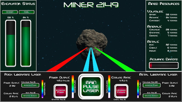
Figure 5: Main gameplay scene showing the overall layout of the UI elements in v2.0.
Even with the improvements, I still feel that these data are not portrayed as clearly and effectively as they could be. New lamp assets need to be created for the oxygen and fuel warning lamps. They are identical to the interactive power and cooling upgrade buttons, and they need to be different, distinguishing them as non-interactive status lamps, not control buttons. The temperature colorbars need to have a bezel around them to keep in the same theme as the other buttons and displays. Lastly, the numeric data needs to be displayed as a proper display panel readout screen. Perhaps not as a seven-segment display, but something that more closely resembles a display field rather than the straight text that exists currently.
Lessons Learned
Resource Management
Through the process of adjusting the power outputs and cooling rates for the lasers, the harvest rates for the various resources, and depletion rates for the water and methane resources, it became abundantly obvious that balance was key. As with most systems, everything is connected to everything else, and making an adjustment to one parameter requires additional changes that propagate through the rest of the system. Before implementing this type of mechanic as a mini-game within a larger game context, a spreadsheet will definitely be created allowing for the interdependencies of all of the various laser and resource parameters to be defined mathematically. With such a tool, various key parameters can be adjusted, and their affects propagated algorithmically through the system without the need to spend additional time playtesting.
Prominently Present Key Parameters
Mission-critical data needs to be displayed in the area of the screen on which the player spends the majority of their time focusing. Not only do these elements need to be in a highly visible space, they also need to be large enough and distinct enough from neighboring elements to be noticed. A significant change from v1.0 to v2.0 was the placement of the Upgrade Excavator button directly above the Main Pulse Laser activation button, the button that the player will be clicking on most of the time during the game. Not only was the Upgrade Excavator button relocated, it was also enlarged to make it more visible. An audio chirp was also added to further draw the player’s attention to the new data being presented.
Likewise, the critical values of the oxygen and fuel supplies were relocated to their own separate UI panel with a large bar-style gauge that indicates the current status of those critical resources. If these parameters are not readily apparent to the player, and apparent that they are diminishing, there will be no motivation for the player to pay attention to them creating a sense of frustration when they run out and the game ends with the player being unsuccessful, but not immediately understanding why.
Group Data Based on Related Systems
Grouping data displays on a system basis rather than a data type basis helps to provide more meaningful and more easily accessed data regarding those systems. In v1.0, all power output and cooling rate data for the three lasers were placed in the left panel, far away from the controls for their respective lasers. This made for a confusing interface for players. Placing these data next the pertinent laser’s controls in v2.0 helps, but more work needs to be done in simplifying and clarifying the interface. Lesson learned: UI/UX is hard! It’s more than merely placing data and fields on the screen. It’s making those data and controls easily understood and meaningful. In a game where time-sensitive resource management is a key, feedback and information for the player must be immediately clear or it will inhibit the essential experience you wish to create for your player.
Get Miner 2149
Miner 2149
Because lasers are better than pick axes!
More posts
- Mute Button and Balance TweaksFeb 26, 2020
- Better Lasers and Better BalanceFeb 21, 2020
- UI Revamp and BalancingFeb 17, 2020

Leave a comment
Log in with itch.io to leave a comment.