
Miner 2149
UI Revamp and Balancing
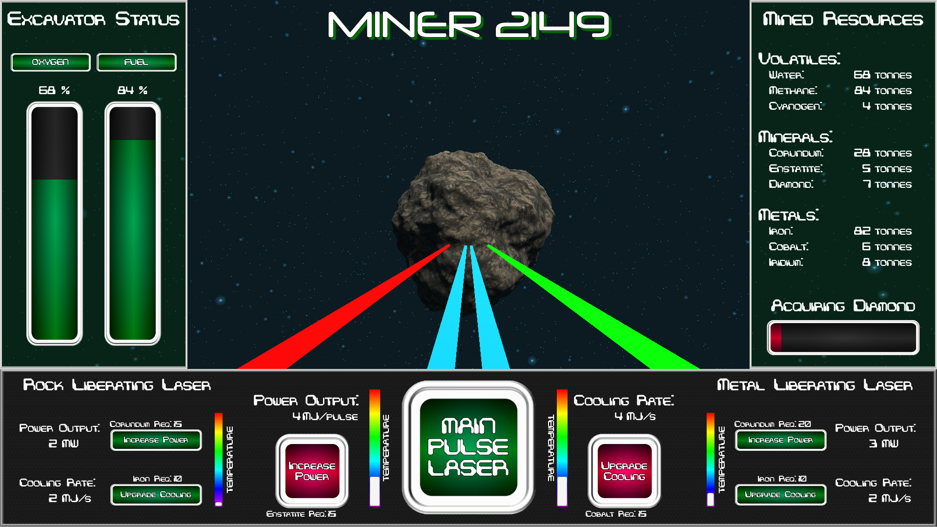
After starting a postmortem analysis of the project, one of the aspects the original version that really bugged me was how cluttered and disjointed the UI felt. There were many elements that were not next to the systems for which they were providing data and others that simply were not being utilized during actual gameplay.
The first elements to hit the cutting room floor were the upgrade increment selection buttons. Although a part of many clicker/incremental style games, for Miner 2149, it just didn't ever come into play. The side panels were diminished in size to enhance the focus on the primary viewport. The progress bar for the goal resource was enlarged for greater visibility, and a message banner along with the "Upgrade Excavator" button displays in the main viewport rather than off to the side when the goal quantity is reached. Lastly, the oxygen and fuel values are now presented as percentages with gauges. These gauges take up the majority of the left UI panel so that they're easy to see even in the periphery. Lastly, a lot of rates and goal amounts were edited to enhance the balance of the prototype.
As always, feedback is welcome.
Files
Get Miner 2149
Miner 2149
Because lasers are better than pick axes!
More posts
- Mute Button and Balance TweaksFeb 26, 2020
- Miner 2149 Postmortem: UI/UX is hard!Feb 21, 2020
- Better Lasers and Better BalanceFeb 21, 2020
Leave a comment
Log in with itch.io to leave a comment.